Dinamundo Prototype
Exploring a Novel Concept

About the Project
This iPhone app was built as proof of concept that bringing travelers and locals together for mutual fun is a viable product. The app was not released, but was the seed for the Dinamundo Project.
My Role
I was the product vision for the app and along with one other engineering partner, Ed Park, built the proof of concept from the ground up. I concepted and designed all flows, screens and interactions.
Exploring a Novel Concept
One fall evening, a friend approached me about a project he was working on. "I've been hired as an engineer to work on this project," he said. "It's a Facebook web app about connecting travelers with locals. It's a great product, but I really think it should be mobile. I want to make a prototype to prove this concept, but I'm not sure where to start. Do you have any ideas?" And of course, I did and by Thanksgiving we had a fully functioning iPhone app.
The Dinamundo Concept App was one of my favorite projects I've worked on because the product was so free-spirited and the development was so organic. We didn't set out intending to build an entire mobile app, but we were having so much fun with the potential of the product that that's what happened.
The concept from the original Facebook app was to inspire locals to meet to gain some sort of mutual benefit out the app. Two people would meet, they would use the product to indicate that they were together (the dual checkin), and then suite of features would open up for the two to enjoy during the duration of their meeting (the mutual benefit). The goal of this concept app was to explore how that would work as a mobile product. We wanted to (1) create a checkin experience that was similar to other checkin apps but had the unique characteristic of requiring two people and (2) explore the different types of mobile interactions we could use to create a unique experience between the two people.
The Dual Checkin
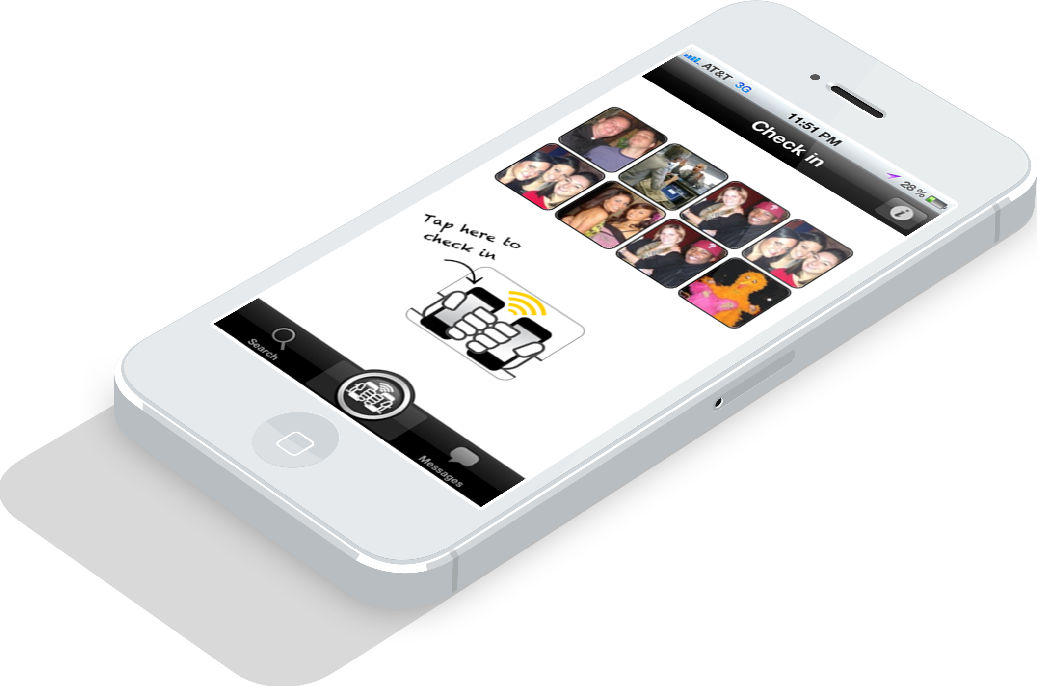
We decided to use bump for the check in because it's a quick, intuitive, frictionless interaction. After all, the fist bump has become a ubiquitous motion for saying hello to a friend. First time users will see an instructional overlay that they can dismiss and then continue to the bump screen that instructs the action with animation. The photo is prompted to create rich content for the app activity feed and enhance the connection between the two people. I included the places screen to bring the whole flow home as a check in.
After the users have checked in, they can scroll through a list of activities and games to play together. They bump again to initiate a game, and can tap end to end the check in all together. The games would only be accessed for a certain period of time, since the end goal is for people to experience them only when they are together.
The Mutual Benefit
When users check in togher, they get the fun of unlocking a suite of games to play together. The goal of the games in the Dinamundo Concept app is to create a unique, bonding experience between two people who may not know each other very well, keeping in mind that one of them is a traveling while the other is a local. Each of the games works towards the purpose of engaging the two users with their surroundings and each other. Additionally, we wanted to explore what sort of unique experiences we could provide with different uses of mobile technology.
The Scavenger Hunt gives the users fun tasks to solve around the city. The “more info” screens are intended to give little known facts about the locations the hunt takes you, so that the local might learn something new as well (not real facts in these screens, just place holders). The Scavenger Hunt also uses QR scan and picture recognition to verify that the users have completed the task.
Get to Know You shows engages the users with each other by offering fun ice-breakers and taking advantage of the phones in a "bump session". Activity Roulette is designed to give the local creative ideas about where to take the traveler by mixing and match activities, characteristics and locations. And, Photo Fun entertains the users with a joint activity as well as produces content for the app.
Conclusion
Ultimately we presented the app to the original product owner (of the Facebook app) who was so impressed with the demonstration that he chose to bring us on full time to build a product around the concept. Though the Dinamundo iPhone App that was ultimately launched was quite different in feature seem the ideas and design from the concept app are seeds of ideas developed more fully in the final product.