Limos.com
On Demand Mobile Rides
Limos for Everyone
Limos.com had a robust car service reservation system. You could book a limo almost anywhere with the network of over 2,000 Operators - as long as the service was at least an hour out. With the rising popularity of products like Uber and Taxi Magic, Limos.com was eager to break into the near-time car service market, and they were poised to do well. And so, the On Demand project was born.
The On Demand Customer app would allow customers to find, book and receive car service all within an hour. The whole endeavor included a customer facing iPhone app, an Operator facing Android app, as well as multiple site and admin features to support the service. I was the lead Product Manager on the product, responsible for the integration of all these facets as well as experience design and product planning.
The first differentiator with our On Demand app would be that we could not only provide rides for the right-here-right-now customer (as other services were doing at the time), but we could also allow the customer to set a ride time anywhere from now to any point in the future. We believed that users would greatly benefit from being able to select 15, 20, 30 minutes instead of being immediately paired with the nearest driver.
There was already an existing iPhone app for reservations; we just had to fill in where that app left off. The second differentiator would be our rates. Most services at the time had a formula based rate system, much like taxis. However, we wanted to be able to say that going from point A to point B using our service costs the same every time, regardless of the traffic or route the driver takes.
The over-arching goal for the On Demand app was to create a simple, easy, straightforward solution for customers looking to book and receive car service within the hour and seamlessly integrate that product offering with our current reservations product. The challenges were, for one, we were introducing the new product market by market so we had to be careful that the new app design did not emphasize On Demand too much, but rather keep an equal balance of entry to both products. Second, On Demand service was a completely new market that we knew little about, so we could send our heads spinning into oblivion trying to consider every edge case. And last, the use cases for the On Demand product and the reservations product were very different - the users have different mindsets and the system requires different inputs - and we had to reconcile these differences to create a cohesive product. It was no easy feat, and the product took a lot of phases.
Project Summary
The On Demand allowed customers to request and receive car service within the same hour. I was responsible for the user experience and the interaction design of this brand new product offering.
Project Goals
(1) Introduce new product without de-emphasizing existing one (2) Solve complex intricacies in new product space.(3) Solve for somewhat opposing use cases in one cohesive solution
My Role
Product Manager
What I did
user flows
wireframes
prototypes
project management
timelines
release planning
scope estimations
api integrations
development requirements
Project Challenges
Level of technical detail
Introduction of a New Product
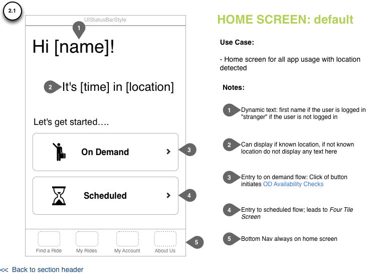
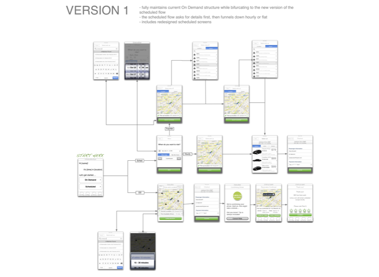
When we first started the project, the primary goal was time to market. Services like Uber and TaxiMagic were growing fast and we wanted to get in the game. We already had a scheduled reservations app, so the strategy was to focus all product development efforts on the On Demand product. We would build out the On Demand side of the app, skin the scheduled app look and feel to be consistent with the new app and learn and iterate from there. The first design featured equal entry to On Demand and Scheduled with a landing screen that asked the user to choose when they wanted to ride. From there, the user was funneled down either the new On Demand flow or the existing reservations flow. We decided on this flow to equalize the balance between Scheduled and On Demand - so that no matter what the user came to the app for, they would not be confused.
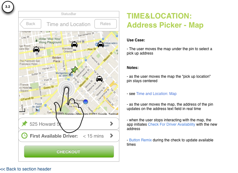
We then began tackling the brand new user experience problems that were unique to the On Demand experience. For example, we wanted to only present the user with ride times that were available for their location to avoid a "bait and switch".
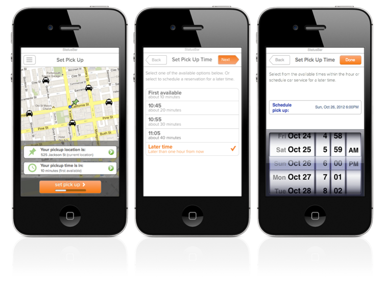
How would we know what drivers were available around the customer? We decided when the customer opened the app, we would check for available drive times of the closest driver, assuming current location was the pick up and set expectations accordingly. Whenever the customer moved the map, the time options for the new location would change and the customer would be notified via an slot-machine-like animation on the time and location form fields.
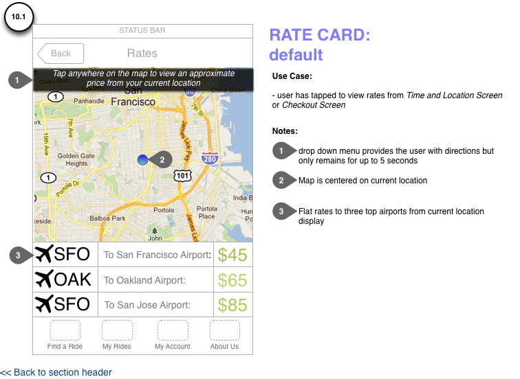
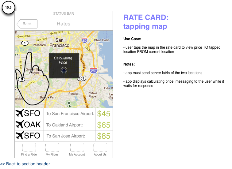
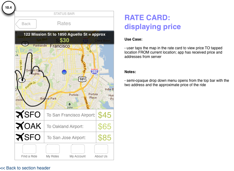
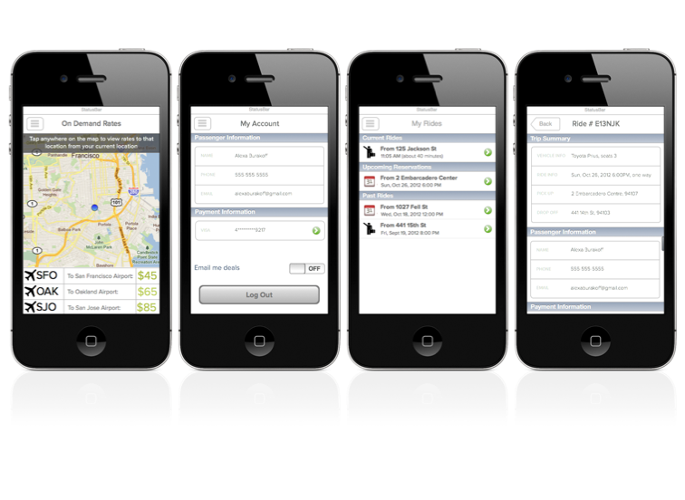
Another novel user experience problem that came with the new On Demand service was how to convey pricing to the customer. In the scheduled reservations product, we had always used the pick up and drop off location as inputs to determine the pricing. But in the On Demand offering, we did not want to have to ask the user for a destination and incumber the ordering process. To solve this problem, we created “the rate card”, that featured the flat rates to nearby airports (the most common type of ride) and an interactive, fun way for the user to get a feel for the pricing structure that re-used the development logic from end ride pricing.
An Analysis of In Progress Strategy
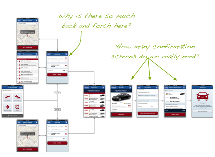
As soon as we had a solid handle on the product requirements for the On Demand side, we turned to the scheduled reservations app to begin unifying the app. As I analyzed the existing scheduled flow, I began to think it was based on some system assumptions that were not translating into a truly useable user experience. I presented a detailed analysis of our current flow including suggestions for modifications on existing screens to improve the user experience. I then presented three options for how we could proceed on the scheduled app ranging from barely alter the flow to completely re-do the flow as if we had no time-to-market requirement.
After discussing as team what the app might look like if we left time-to-market out of the equation, we realized that our original strategy had been wrong.
We decided to re-think the app as one flow taking the emphasis off leveraging existing functionality and moving towards thinking like the user, not the system.
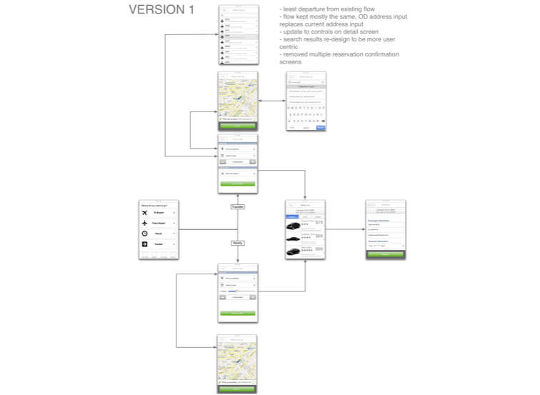
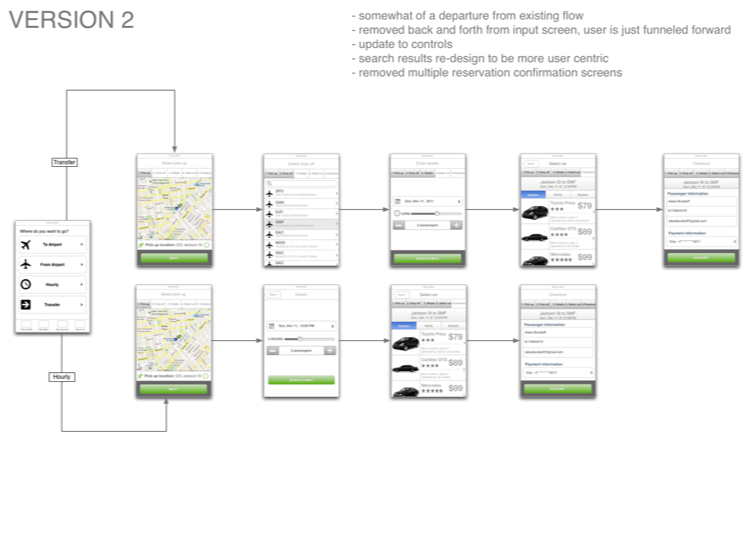
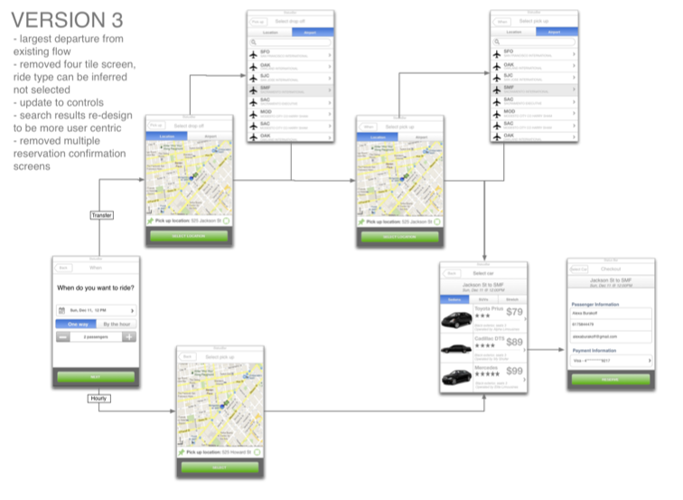
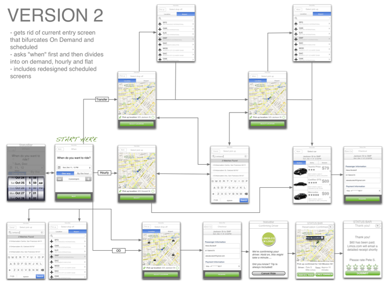
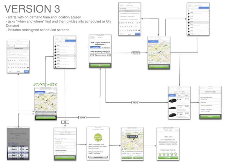
Again, I presented three flows to the team ranging from slight departure from the existing On Demand spec and scheduled reservations live app to largest departure. As a team, we decided to go with the flow that was the largest departure from the existing requirements in the name of a better user experience and it was the right decision. Sometimes, you have to recognize that you’ve gone down the wrong path and re-adjust, even if it means you may have to throw out some work.
Designing a Cohesive Experience
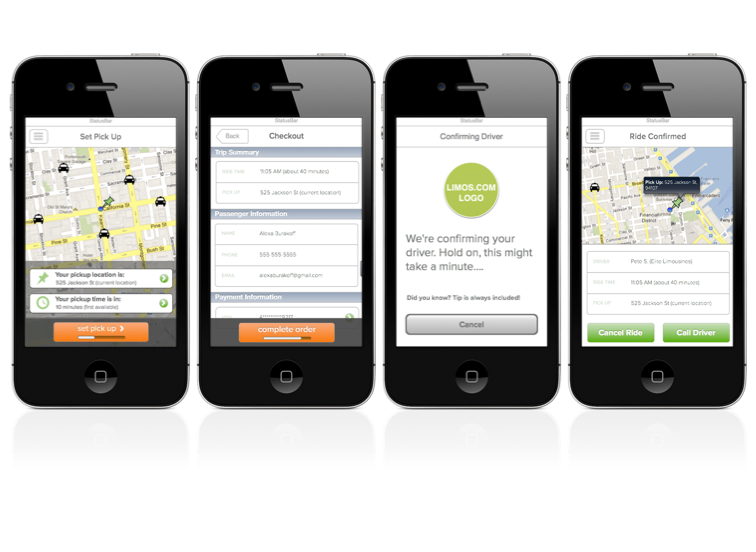
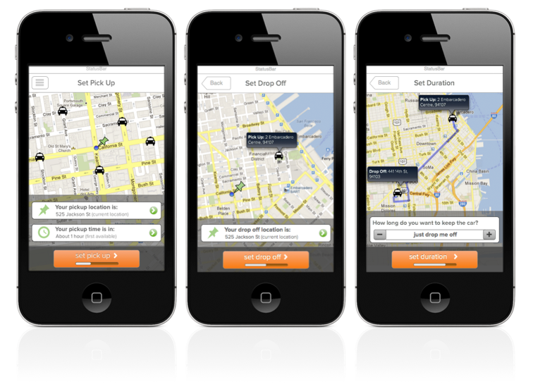
At last, we had a flow that we could all be proud of. It has a balanced entry into On Demand or Scheduled, without asking the user to determine in which category they belong. The first screen asks what is likely to be on the user's mind - when and where do you want to be picked up? The On Demand user can move forward without ever interacting with the date or address controls. However, if the user is looking to schedule for the future, they can easily change the pickup location, date and time, by tapping on the fields.
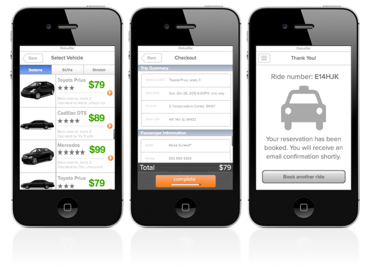
The flow is cohesive and unified. It sets expectations elegantly by using a progress bar on the button as you move through the flow. The interactions on the scheduled screens match those for on demand, so the user feels like they are getting the same experience even though it is different on the back end.
Conclusion
The main lesson I took away from this project was never to prioritize shipping something over shipping the right thing. I believe our emphasis on time to market in at the start of the project, really blinded us from seeing that the right thing to do was to create a holistic experience, rather than to tack On Demand onto our existing functionality. Had we taken a holistic approach from the start, we may have saved some time. However, I was lucky to have been working with a team that was so resilient once we realized what the right path was and know the on Demand app will turn out to be a great product.
Limos.com
